
Contents
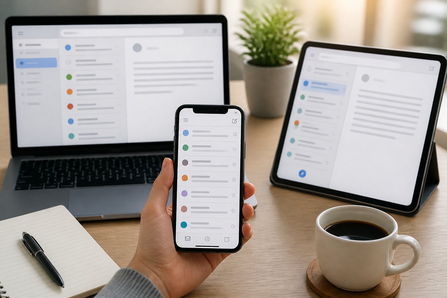
Mobile Responsive Email Design

Most email campaigns are built on a desktop screen and read on a phone. That mismatch is where performance problems begin, and it affects far more than layout aesthetics.

Over 65% of emails are now opened on mobile devices, meaning the majority of your audience will judge your campaign on a small screen before they ever see it on a desktop. When your email breaks at 375px, uses text too small to read without zooming, or buries the call to action below three screens of content, a significant share of those readers simply delete it or unsubscribe.
This guide is built for teams that already understand campaign fundamentals but want clearer, more reliable standards for responsive execution. It covers layout decisions, coding trade-offs, content choices, testing priorities, and measurement, grounded in what actually survives across real email clients rather than idealised browser behaviour.
Why Mobile Email Performance Matters
Mobile reading habits and inbox engagement are directly connected to revenue outcomes. When your email renders poorly on a phone, it does not just look bad; it costs you opens, clicks, and conversions at a measurable rate.
Mobile Reading Habits
Your subscribers check email on their phones throughout the day, often in short bursts with limited attention. The inbox is scanned, not studied. Subject lines get a glance. Emails that feel cluttered or hard to navigate are closed within seconds.
This changes what your email needs to do. Content must load quickly, communicate its value in the first visible screen, and make the next action obvious. Long introductions, dense paragraphs, and small tap targets are a friction cost you cannot afford when someone is reading on a commute or between meetings.
Gmail alone reports that 75% of its user base accesses the app on a phone. When you design primarily for desktop, you are optimising for a minority of your audience.
Impact On Click-Through And Conversions
Poor mobile rendering has a direct impact on campaign performance. Research consistently shows that recipients delete emails that do not display correctly, and many unsubscribe entirely after a bad experience.
Click-through rates drop when buttons are too small to tap accurately, when links are clustered together, or when the call to action sits so far down the email that most readers never reach it. On a phone, the visible area without scrolling is roughly 300 to 400 pixels of content. If your primary CTA is below that threshold, a meaningful portion of your audience will never see it.
Conversions are also affected indirectly. Some subscribers open an email on their phone and complete a purchase later on a desktop, so a consistent, readable mobile experience keeps that journey intact rather than breaking it at the first touchpoint.
Core Principles Of Responsive Layouts

Effective mobile email layouts rely on structure, clarity, and touch-awareness working together. Getting these three areas right reduces rendering failures and makes your content easier to act on.
Single-Column Structures
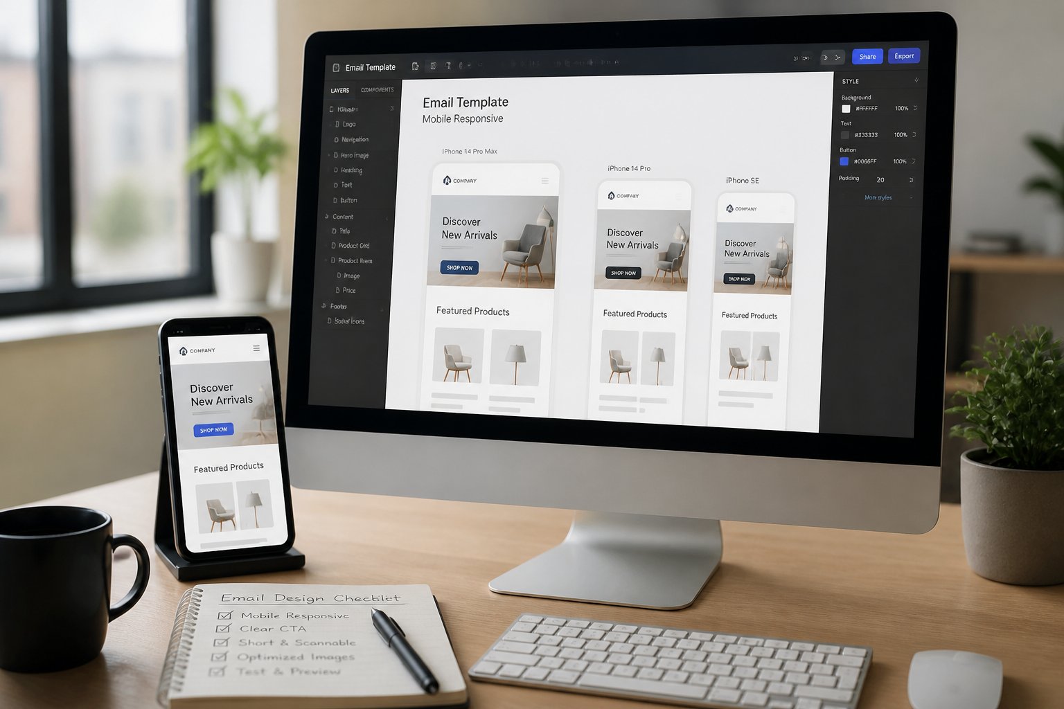
A single-column layout is the most reliable structure for mobile email. Multi-column designs often collapse unpredictably at narrow viewports, especially at 480px or below, and the results vary across clients. What looks clean in your preview can break badly in Gmail on Android or Outlook on iOS.
Build your layout on HTML tables rather than CSS floats or flexbox. Tables render consistently across a much wider range of email clients. Set your email width to 600px and use your media query breakpoint at 480px to shift the layout into a full-width, single-column format for smaller screens.
White space is productive in this context. Giving sections room to breathe reduces accidental taps and makes content easier to scan quickly.
Scannable Visual Hierarchy
On a small screen, readers scan before they read. Your layout needs to guide the eye from the most important information to the least, without requiring effort from the reader.
Use clear heading sizes, typically 18 to 22px, with body text at a minimum of 16px. Contrast between heading and body text creates a rhythm that supports scanning. Keep sections short and use visual separation, such as spacing and image placement, to signal where one idea ends and another begins.
Avoid stacking too many competing elements. Each section should have one clear purpose.
Touch-Friendly Interaction
Every tappable element in your email needs to work reliably on a touchscreen. The minimum recommended tap target size is 44 by 44 pixels, which aligns with WCAG 2.1 accessibility guidance. Buttons smaller than this lead to mis-taps and frustration.
Spacing between links and buttons matters as much as size. When clickable elements are too close together, readers tap the wrong one and lose trust in the experience. Give each interactive element enough padding so that a thumb press lands accurately without precision.
Avoid hover-dependent design patterns. On mobile, hover states do not trigger, so buttons and links need to look tappable by default through colour contrast and visible boundaries.
Choosing A Build Approach

The three main build approaches for responsive email each involve real trade-offs between flexibility, client support, and complexity. Choosing the right one depends on your team’s technical capacity and the clients your audience uses most.
Fluid Email Design
A fluid layout uses percentage-based widths rather than fixed pixel values. The email expands and contracts to fill whatever viewport it is viewed in, without requiring media queries to trigger layout changes.
This approach has broad client compatibility because it does not depend on CSS features that some clients strip out. The trade-off is control. On very large screens, a fluid layout can stretch uncomfortably wide, and on very small screens, text and buttons can feel undersized unless you set minimum widths carefully.
Fluid design works well for simpler templates or teams that need a low-maintenance approach with reliable rendering across a wide range of clients.
Media Query Techniques
Media queries allow you to apply specific CSS rules when the viewport reaches a defined width. At your breakpoint, typically 480px, you can switch from a multi-column layout to a single column, increase font sizes, resize buttons, and hide or show certain elements.
The limitation is client support. Gmail has historically stripped out head styles, including media queries, in certain rendering modes. Outlook uses a Word-based rendering engine that ignores many modern CSS properties entirely. If a significant portion of your list uses these clients, media query-only responsive design will not reach all of them.
Always define fallback styles that work without media queries as your base, then layer the responsive overrides on top.
Hybrid Coding Methods
Hybrid coding, sometimes called spongy design, combines fluid percentage widths with max-width constraints and selective use of media queries. The layout is fluid by default, so it degrades gracefully in clients that ignore CSS, but it uses media queries to make precise adjustments where client support allows.
This is the most broadly recommended approach for teams sending to mixed audiences. It handles the Outlook and Gmail rendering gaps better than a pure media query approach while still giving you control over the finer details on clients that support modern CSS.
The complexity cost is real. Hybrid templates take longer to build and test, but the rendering reliability across clients is worth it for campaigns where performance matters.
Designing Content For Small Screens
Content decisions affect mobile performance as much as layout choices do. Small screens compress the visible space available, which changes how subject lines, type, images, and buttons need to be handled.
Subject Lines And Preheader Copy
On most smartphones, Gmail on Android shows roughly 33 characters of a subject line by default. That is your working limit for the most important text in your email. Lead with the specific benefit or most compelling detail first; do not bury it after a greeting or preamble.
The preheader is the short text that appears next to or beneath the subject line in the inbox preview. Many teams leave this as “View this email in your browser,” which wastes high-value visible real estate. Use it to extend the subject line’s message, add a secondary detail, or include a soft call to action. Together, subject line and preheader drive open rate before a single word of the email body is read.
Keep subject lines to five or six words where possible. Preheader copy should stay under 40 characters to avoid being cut off.
Readable Typography Choices
Font size has a larger impact on mobile readability than most designers expect. Body text at 14px is technically readable but causes many recipients to zoom in, which breaks the layout entirely. Set body text at a minimum of 16px. Headings should sit between 18px and 22px.
Stick to system fonts: Arial, Verdana, Georgia, and Tahoma render consistently across every major client and operating system. Custom web fonts may look refined in your design tool but will often fall back to defaults in Gmail, Outlook, and Apple Mail, sometimes in ways that disrupt spacing and line length unpredictably.
Line length also matters. On a full-width single column, very long lines of text become harder to follow. Use padding on the sides of your text blocks to keep line length comfortable.
Image Use And Fallback Planning
Images in responsive emails should be simple and bold enough to read at small sizes. Fine details that read clearly at desktop resolution often become illegible when scaled down to 375px. Use solid backgrounds and clean compositions rather than complex photography with small text overlaid.
Every image must include a descriptive ALT attribute. Several clients, including some Outlook versions and certain mobile configurations, block image loading by default. When images are blocked, only the ALT text appears. A useful ALT text describes the content and action: “30% off all items this week, shop now.” A filename like “banner01.jpg” communicates nothing.
Do not build your email’s entire message inside a single image. If images are blocked, the email appears blank, and your message is lost entirely.
Button Placement And Tap Targets
Your primary call to action button should be visible in the first screen of the email on mobile, within the first 300 to 400 pixels of content. If it appears further down, a portion of your audience will never reach it.
Buttons need a minimum size of 44 by 44 pixels, with enough padding around the text to make the tap area comfortable. Use high-contrast colours between the button background and label so it looks actionable without relying on hover states. On mobile, hover effects do not trigger, so the default state is the only state your readers will see.
Place adequate spacing around buttons so they are not adjacent to other links. Accidental taps on nearby elements create a poor experience and can inflate click data in misleading ways.
Testing Across Clients And Devices

Testing is where the gap between design intent and inbox reality becomes visible. What looks correct in a drag-and-drop editor or browser preview may render very differently across actual clients and devices.
Client Rendering Differences
No two major email clients handle HTML and CSS the same way. Outlook on Windows uses a Word-based rendering engine, which means it ignores many standard CSS properties, including certain padding values, border-radius, and background images. Gmail strips head styles in some rendering modes, which can break media queries. Apple Mail and iOS Mail support modern CSS more fully but introduce their own quirks around dark mode and font sizing.
Tools such as Litmus and Email on Acid allow you to preview your email across dozens of client and device combinations before sending. These are worth using on any template you plan to reuse, and on campaign-specific builds before significant sends. Do not rely on your ESP’s built-in preview alone.
Building in known fallbacks from the start is more efficient than debugging after a send. Define base styles that work without CSS support, then layer enhancements for clients that handle them correctly.
Accessibility Checks
Accessibility in email affects a wider audience than most teams account for. Colour contrast, text size, ALT text on images, and logical reading order all contribute to whether your email is usable for people with visual impairments or those using screen readers.
Check that your text-to-background contrast meets WCAG 2.1 minimum ratios. Avoid communicating important information through colour alone. Ensure that your HTML reading order reflects the visual order of your layout, since screen readers follow the source order rather than the visual presentation.
Semantic, well-structured HTML is also more resilient in email clients that apply their own rendering rules, so accessibility and rendering reliability often reinforce each other.
Load Speed And Image Blocking
Large image files slow down email loading, particularly on mobile data connections. Compress images before embedding or linking them. Use JPG for photographs, PNG for graphics with transparency, and WebP where client support allows. Aim to keep your total email file size manageable; heavy emails can be clipped by Gmail, which cuts content off and replaces it with a “View entire message” link.
Image blocking remains common across enterprise email environments and some mobile configurations. Test your email with images disabled to confirm that the layout holds and the message remains clear using only text and ALT attributes. An email that falls apart when images are off is fragile in a significant portion of real inboxes.
Measuring Results And Improving Iteratively

Measuring mobile email performance gives your team the data needed to move from assumptions to reliable patterns. Iterative improvement based on segmented metrics is more effective than periodic redesigns based on instinct.
Mobile Engagement Metrics
Segment your reporting by device type to understand how mobile recipients behave compared to desktop. Open rate by device shows whether your subject line and preheader are working for mobile inboxes. Mobile click-through rate reveals whether your layout and CTA placement are effective on small screens specifically.
Scroll depth and time-on-email data, where available through your ESP, can indicate whether readers are engaging with the full content or dropping off early. A high open rate paired with a low mobile CTR often points to a layout or content issue rather than a deliverability problem.
Track unsubscribe rates by device as well. A spike in mobile unsubscribes after a campaign redesign is a clear signal that the rendering experience degraded for that segment.
A/B Testing Priorities
Not every element is worth testing simultaneously. Prioritise variables that have the highest likely impact on mobile performance: subject line length and front-loading, CTA placement above versus below the fold, single-column versus hybrid layout, and image-heavy versus text-light content ratios.
Run tests on segments large enough to produce statistically meaningful results. Testing on a small list produces noise rather than signal. Document what you test, what you change, and what the outcome was, so your team builds institutional knowledge rather than repeating the same experiments.
Test one variable at a time where possible. When you change multiple elements in a single test, you cannot attribute the outcome to any specific decision.
Common Performance Fixes
Several issues appear consistently in underperforming mobile campaigns. Buttons sized below 44px produce low click rates and high mis-tap rates. Font sizes below 16px cause readers to zoom, which breaks layout and increases drop-off. CTAs placed too far down the email are missed by readers who do not scroll.
Images without ALT text create blank email experiences for a portion of your audience. Dark mode incompatibility, where light text disappears on a dark background or buttons become invisible, affects a growing share of users across Apple Mail, Gmail, and Outlook.
These are not difficult fixes individually. Building a short pre-send checklist that covers tap target sizes, font sizes, ALT text, dark mode rendering, and CTA placement above the fold will catch the majority of common issues before they affect campaign performance.
YOUR NEXT MOVE